-
Strategy · Brand Identity
Café Serene sits on a corner of Atlanta's coffee scene, one crowded with reclaimed wood, neon signage, and murals shouting for attention. Serene needed the opposite: an identity confident enough to go quiet.
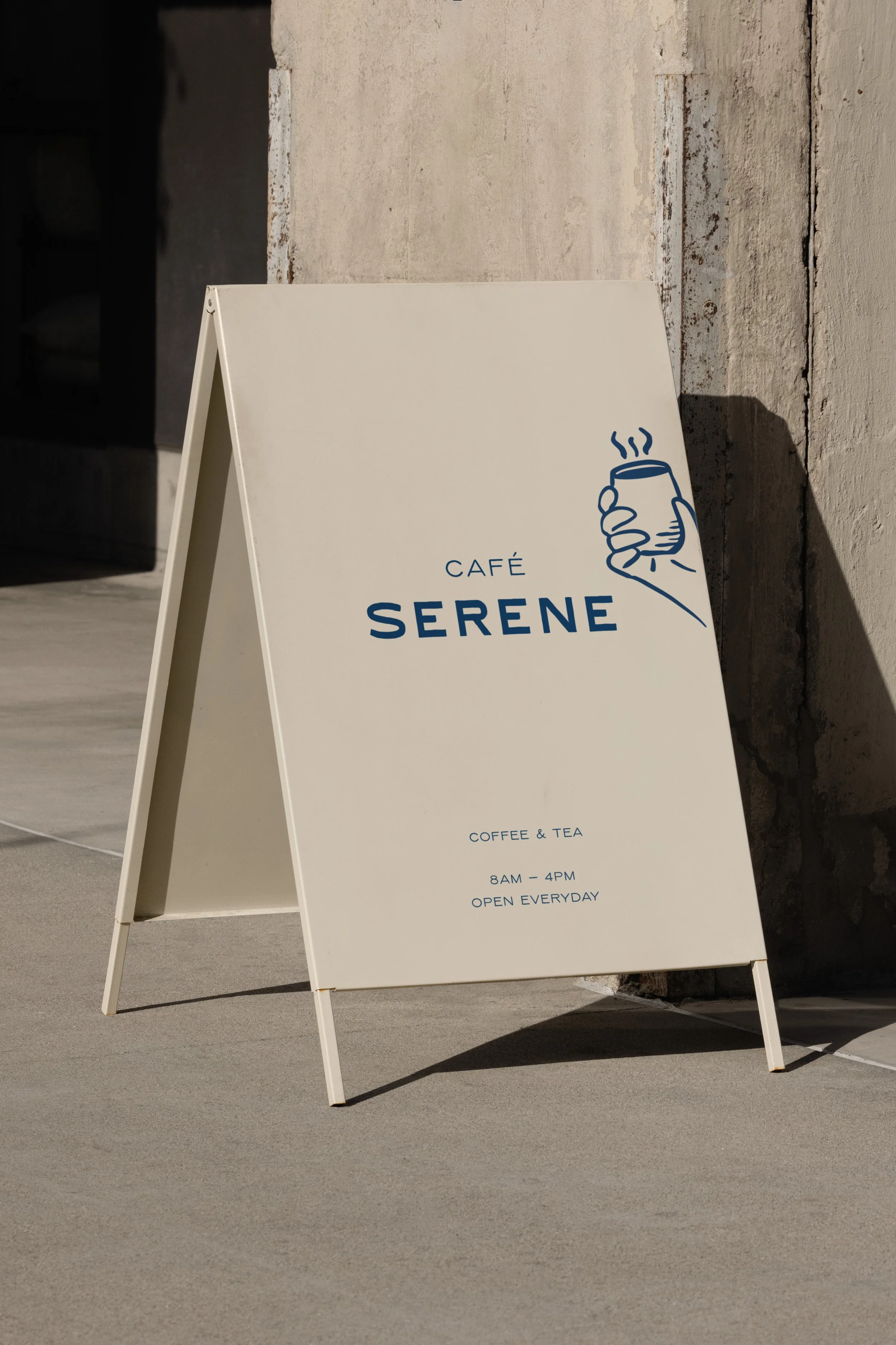
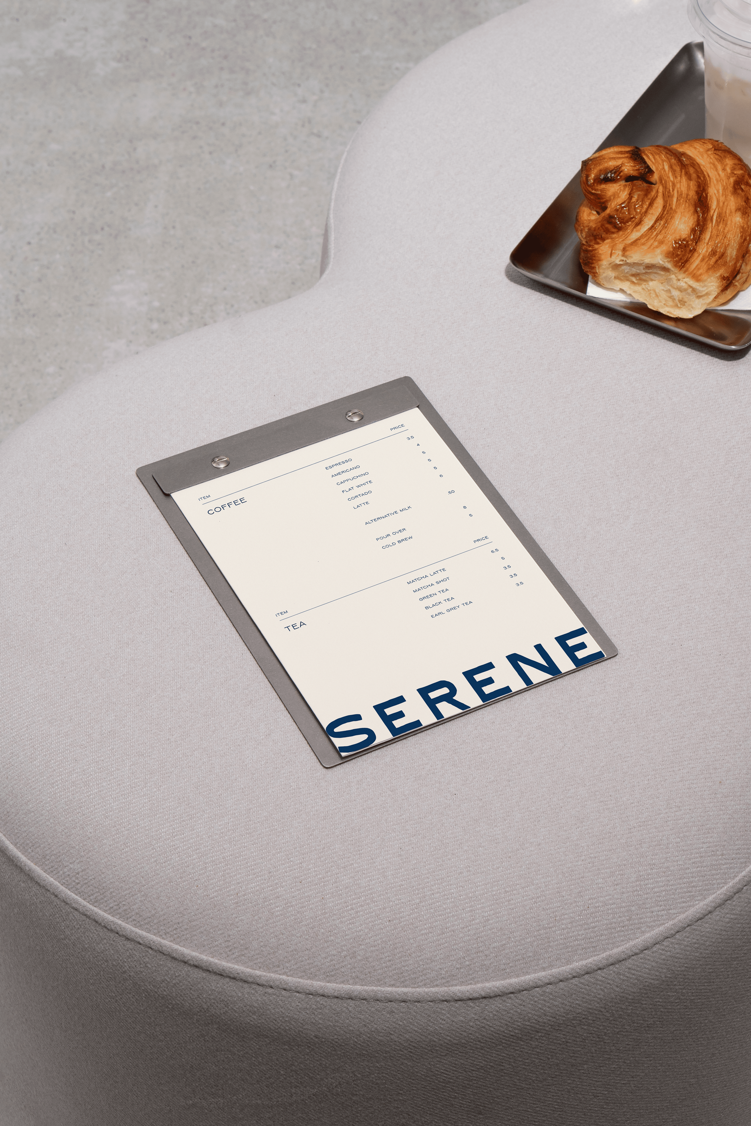
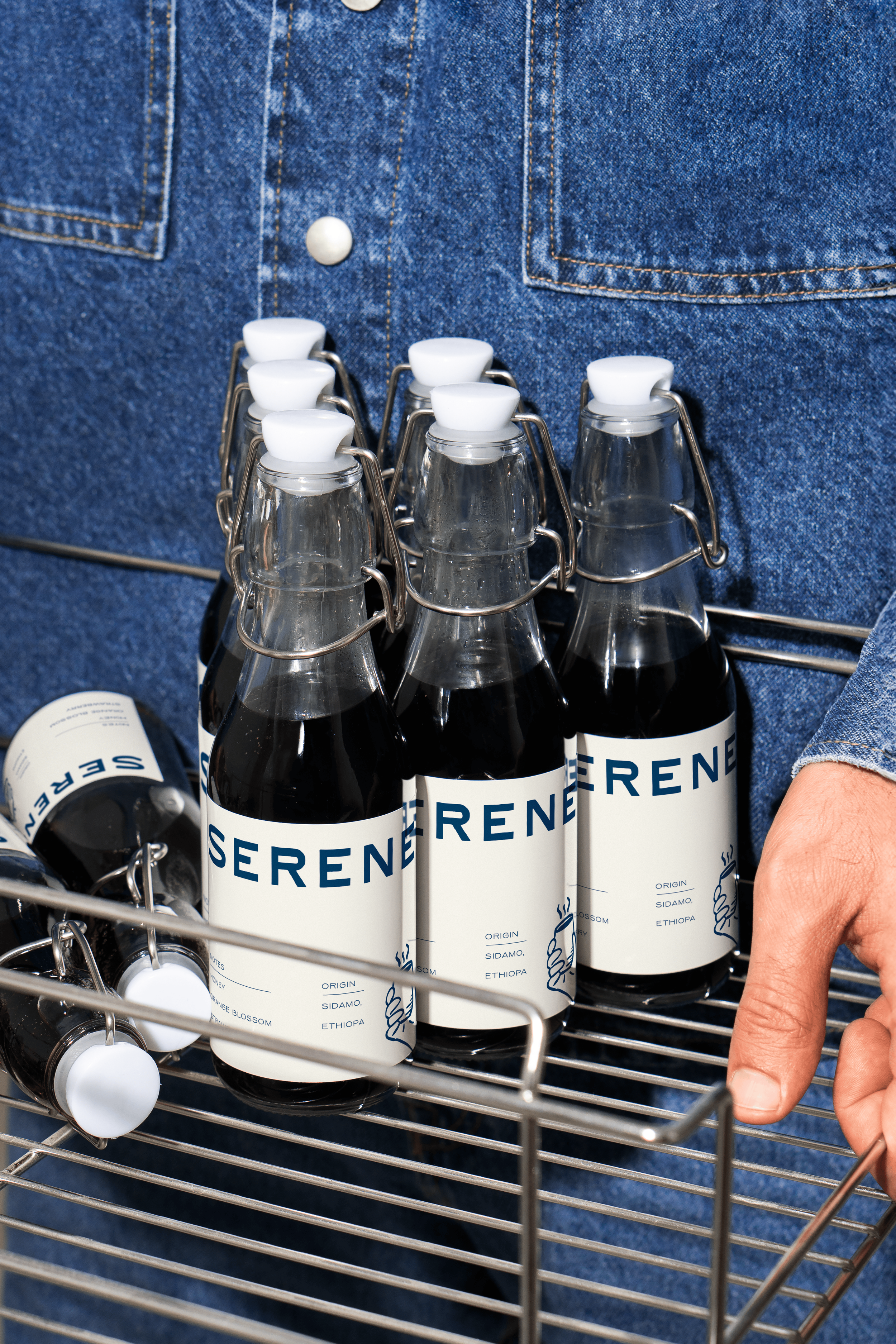
We built the strategy, a custom typeface, and a hand-drawn illustration system that gave Serene a voice no template could touch, refined where it needed to be, playful where it counted, made by people, not a font library. In a category built on noise, Serene is the exception.
-
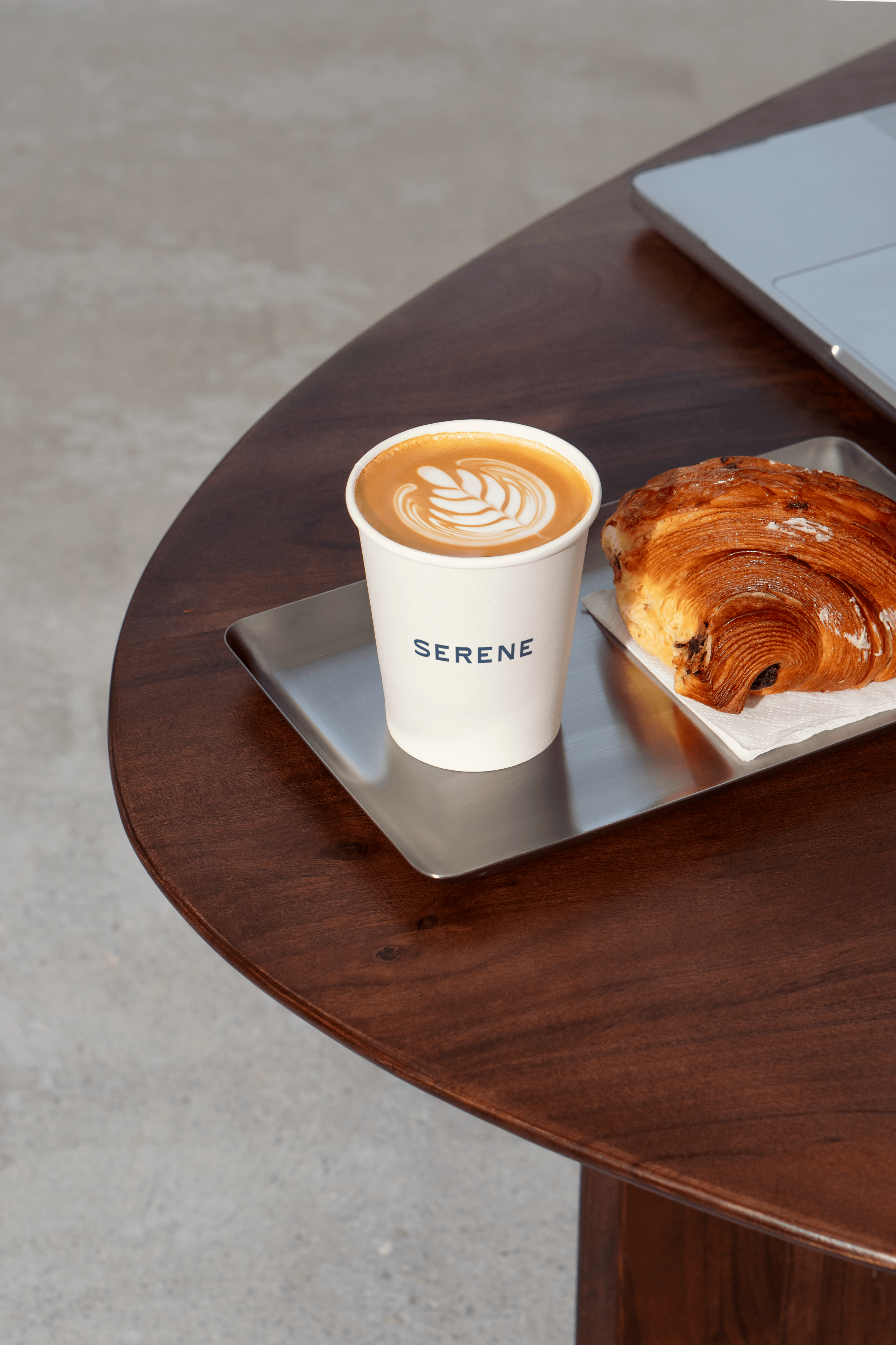
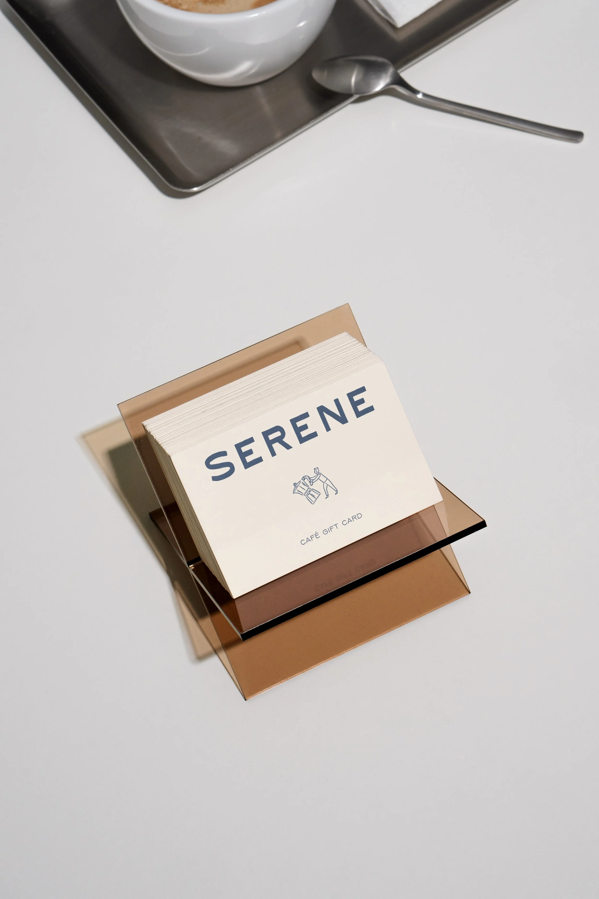
We sourced a bespoke typeface for Serene, custom-cut with enough character that no other café's identity could carry it. Alongside it, we developed a hand-drawn illustration system, small, considered details carried through packaging, signage, and in-store collateral. The pairing gave Serene real restraint where it mattered and genuine playfulness where it counted, an identity that reads as entirely its own.