-
Strategy · Brand Identity
Q Farm was founded by a family with roots in medicine, people who understood, long before it was trendy, that health starts with what's grown, not what's manufactured. In a Kuwaiti market shaped by imported produce, homegrown food had become the exception.
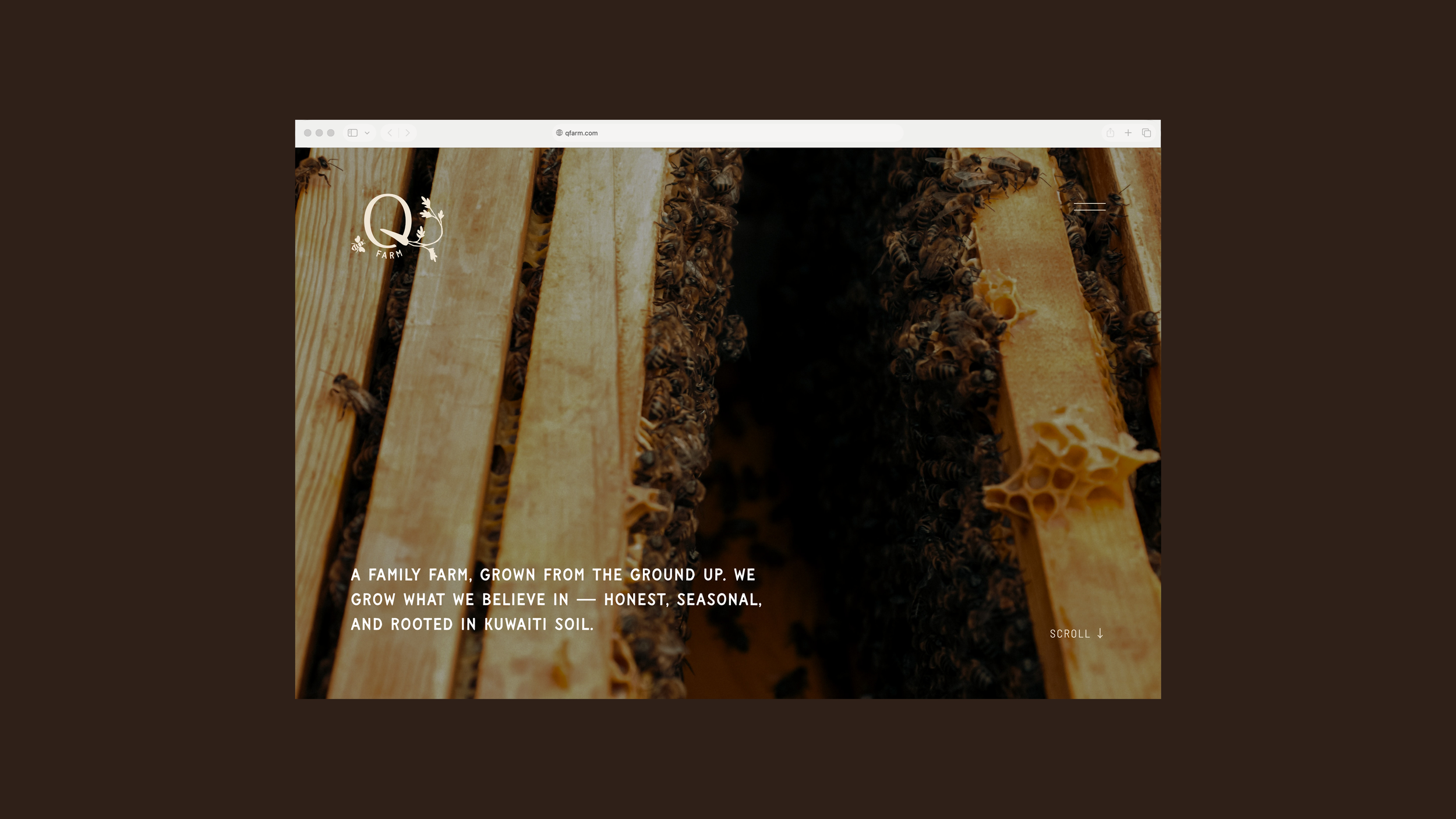
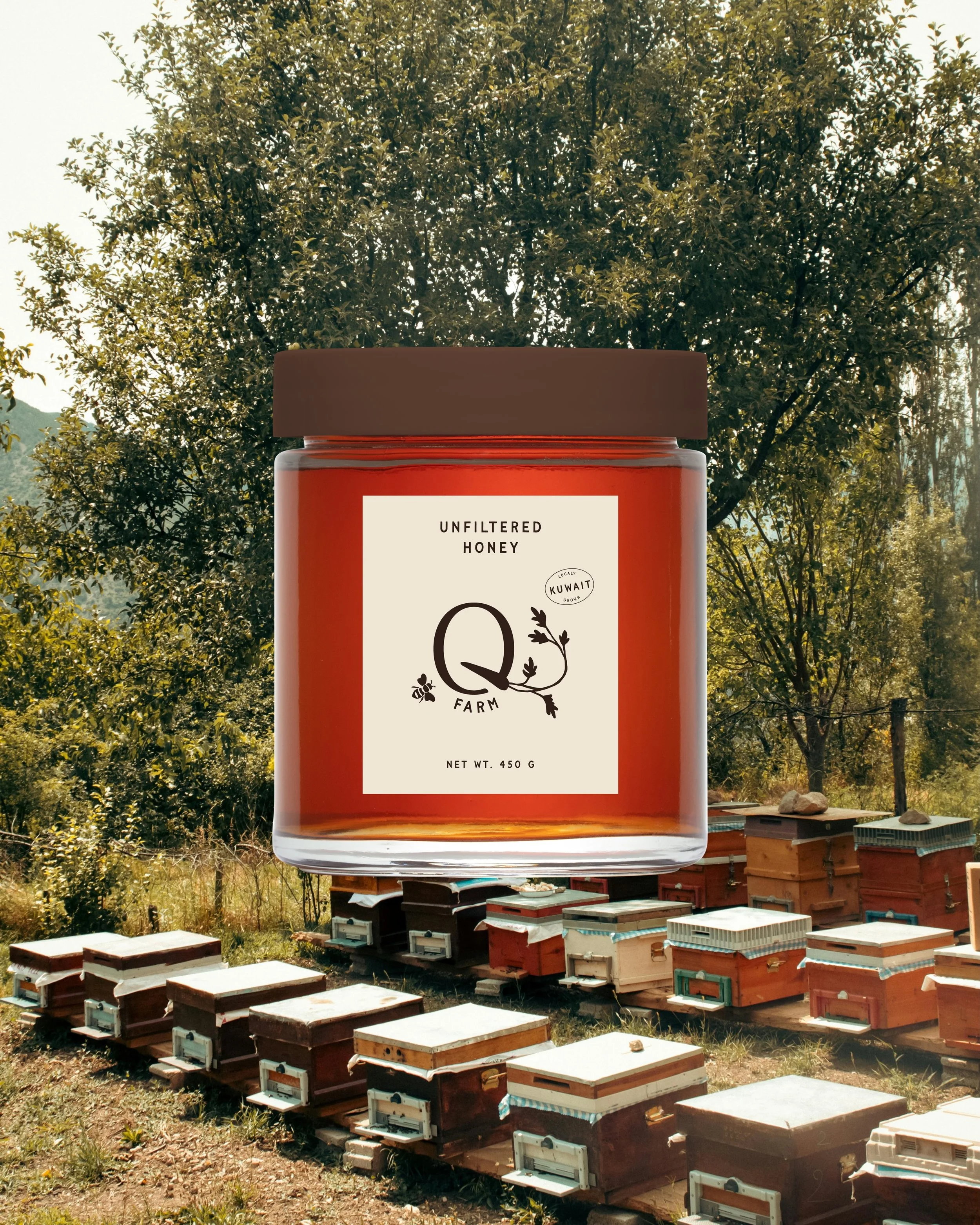
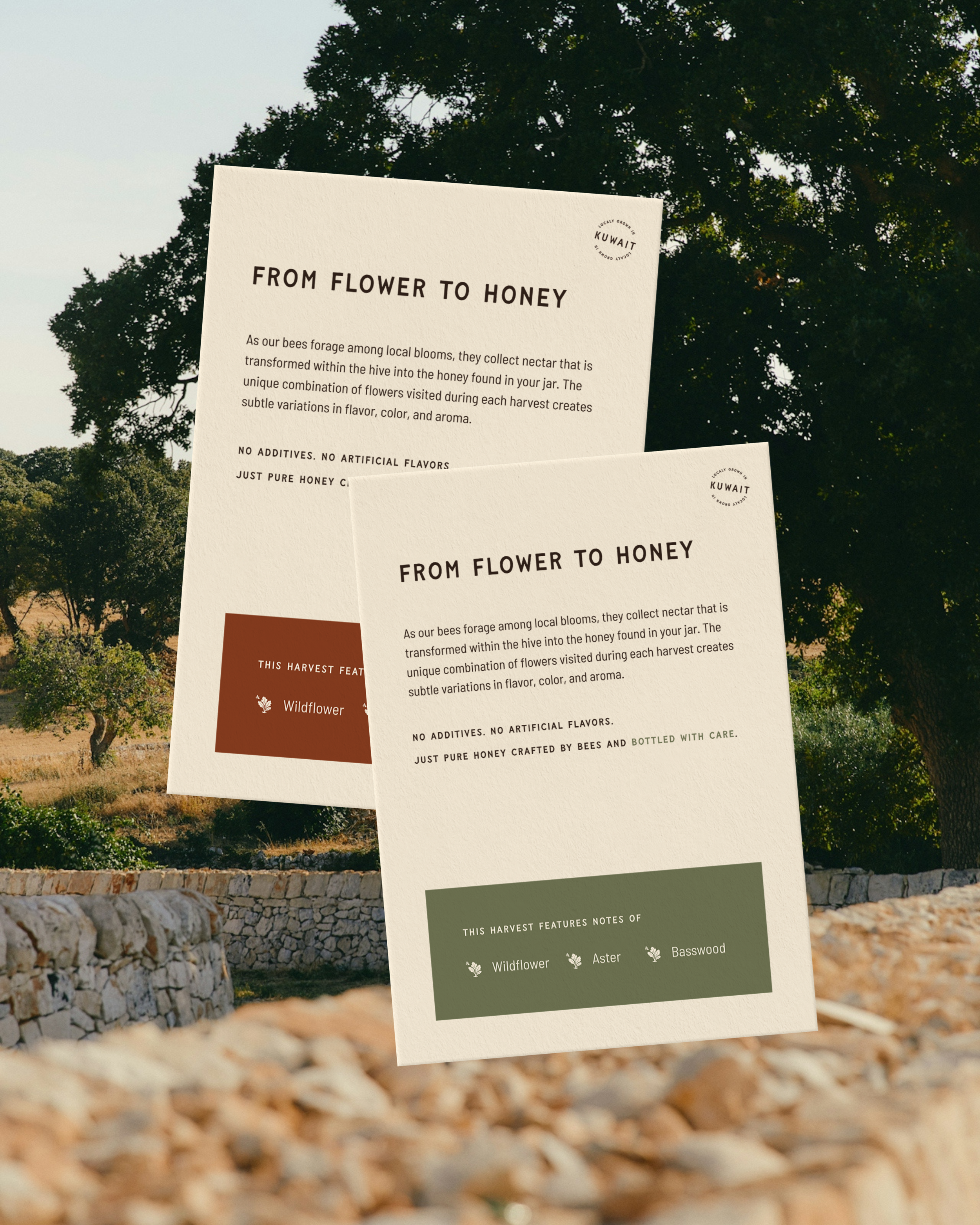
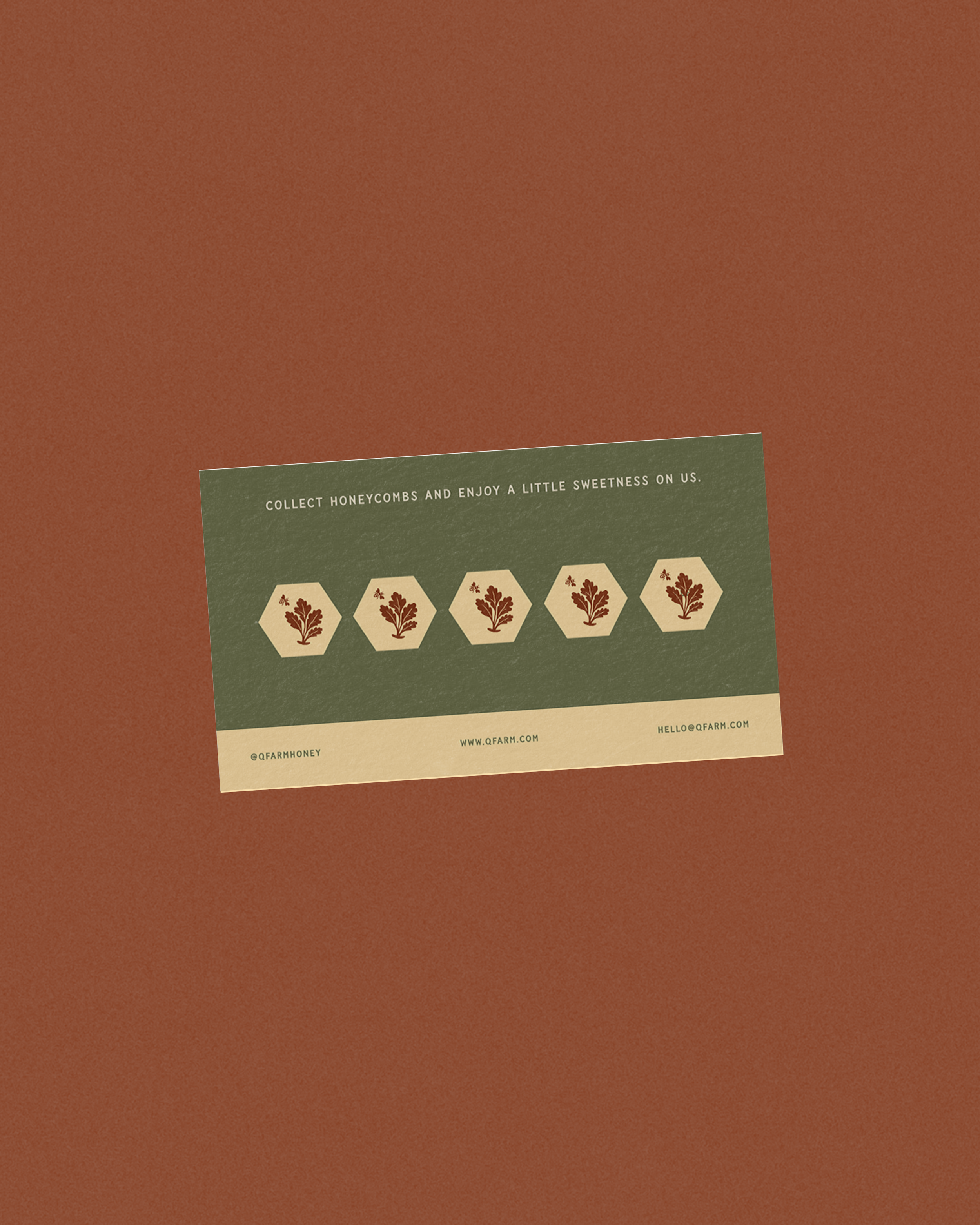
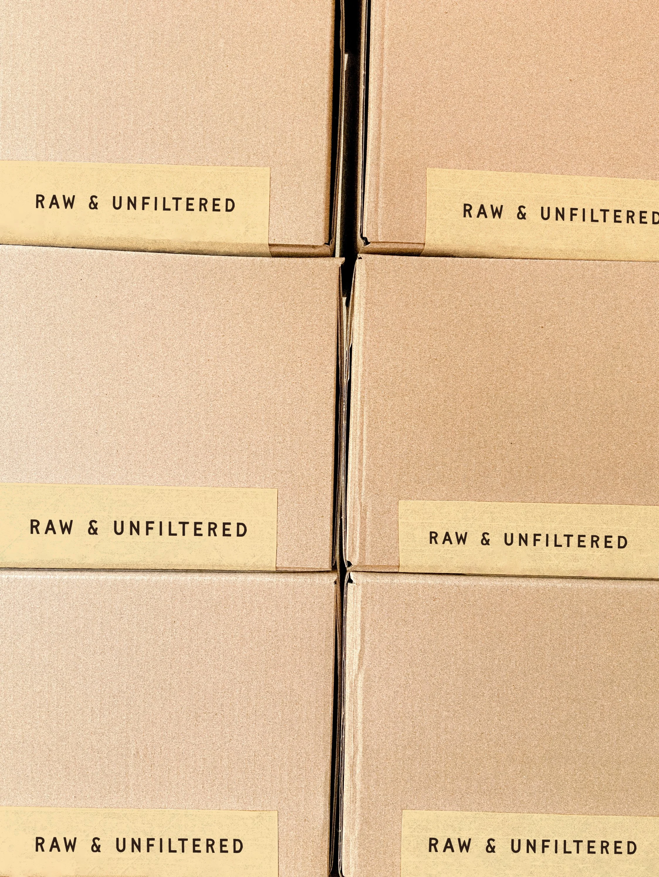
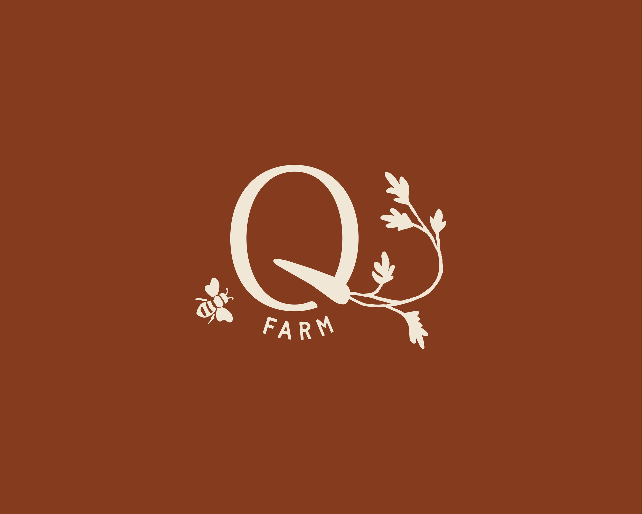
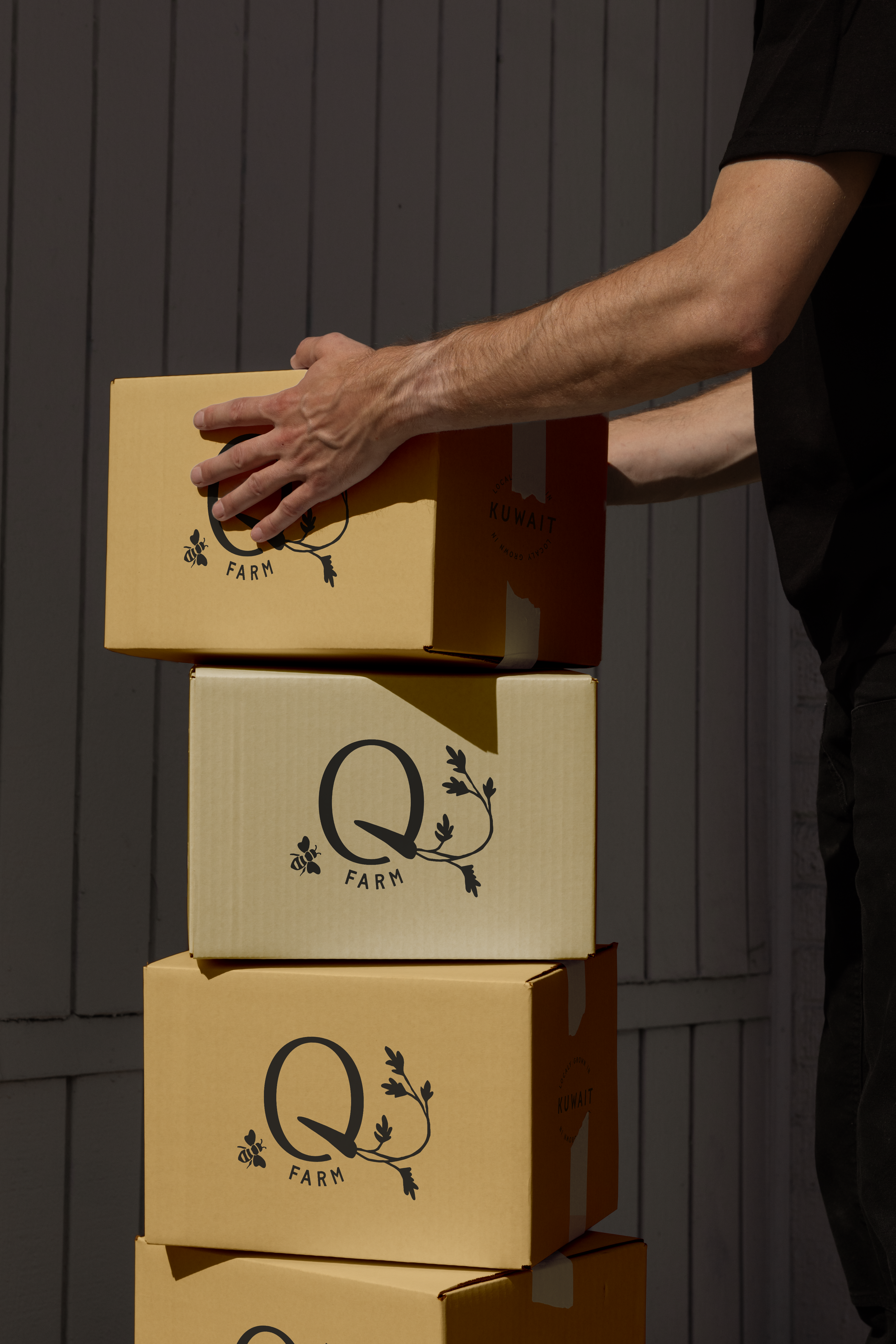
We built Q Farm's identity, packaging, and illustration system around that conviction: a mark and palette drawn from the land, patterns that carry the farm's texture onto every box and label.
-
The illustration system carries most of Q Farm's personality: hand-drawn characters and motifs pulled straight from the farm, hens, harvest baskets, hands in soil, rendered loose enough to feel sketched, not art-directed. They move across packaging, signage, and social content, turning each touchpoint into a small scene instead of a static label.
Paired with a warm, earthy palette drawn from the land itself, the identity carries the same care the family brings to their fields: present in every detail, never overproduced.